Branding BLVD Club
BLVD Club is positioned as an exclusive club for the creme del-a-creme of Bengaluru. But the club is not intended to be opulent or garish. The architecture, interiors and general finishings reflect an ethos of modernity, simplicity and refinement.
Concept
The positioning respects the members’ privacy by creating an identity that is equally understated. This is also carried forward in the tone of voice of the communication where a sense of identity ‘silence’ is created by saying very little, which in turn also creates a sense of ‘elitism’.
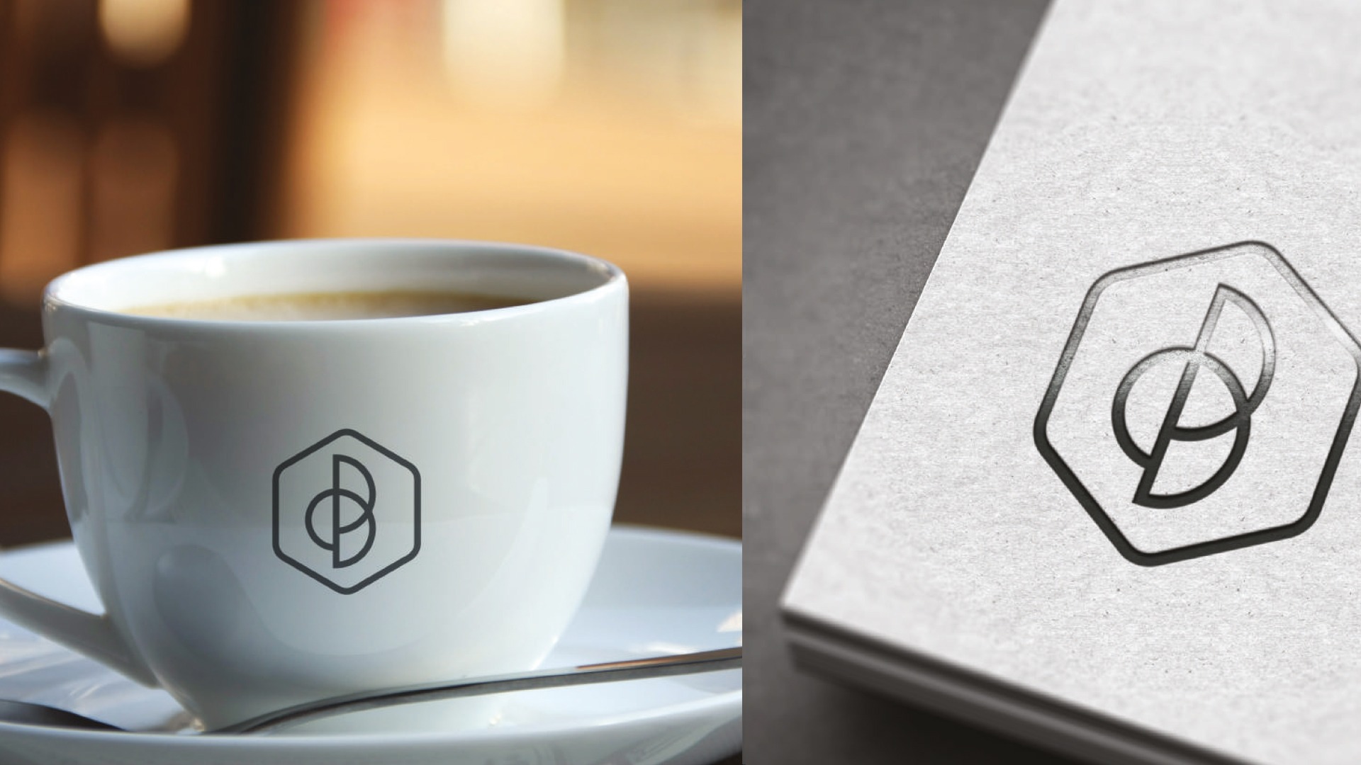
The identity explores a modern and minimal interpretation of an emblem. The symbol is designed as a distinctive crest, derived from the letterforms ‘C’ and ‘B’, to express new age luxury lifestyle.

The crest is disassembled to create a pattern that is carried forward as the visual language

The imagery and the colors reflect a subtle sense of luxury and elitism

The stationary carries forward the branding elegantly


The brand logo forms a crest that applies itself seamlessly across cutlery and can be used with multiple surface treatments

The brand logo forms a crest that applies itself seamlessly across cutlery and can be used with multiple surface treatments

The teaser campaign showcases only the crest and club name, reinforcing the excluvisity of the club

The campaign uses the crest symbol to encapsulate the image giving an impression of the cultivating bonds within the club
