About the organization
Kranti is a brand with a mission. Kranti intends to revive and regenerate interest in craft products. By doing so, Kranti will become a revenue provider to families practicing craft for generations.
The design exercise presented here shows a first cut presentation towards a design strategy, branding and a retail experience for Kranti.
Concept
The identity for Kranti revolves around the idea of taking hand-crafted products made by rural artisans and placing them in a modern environment.
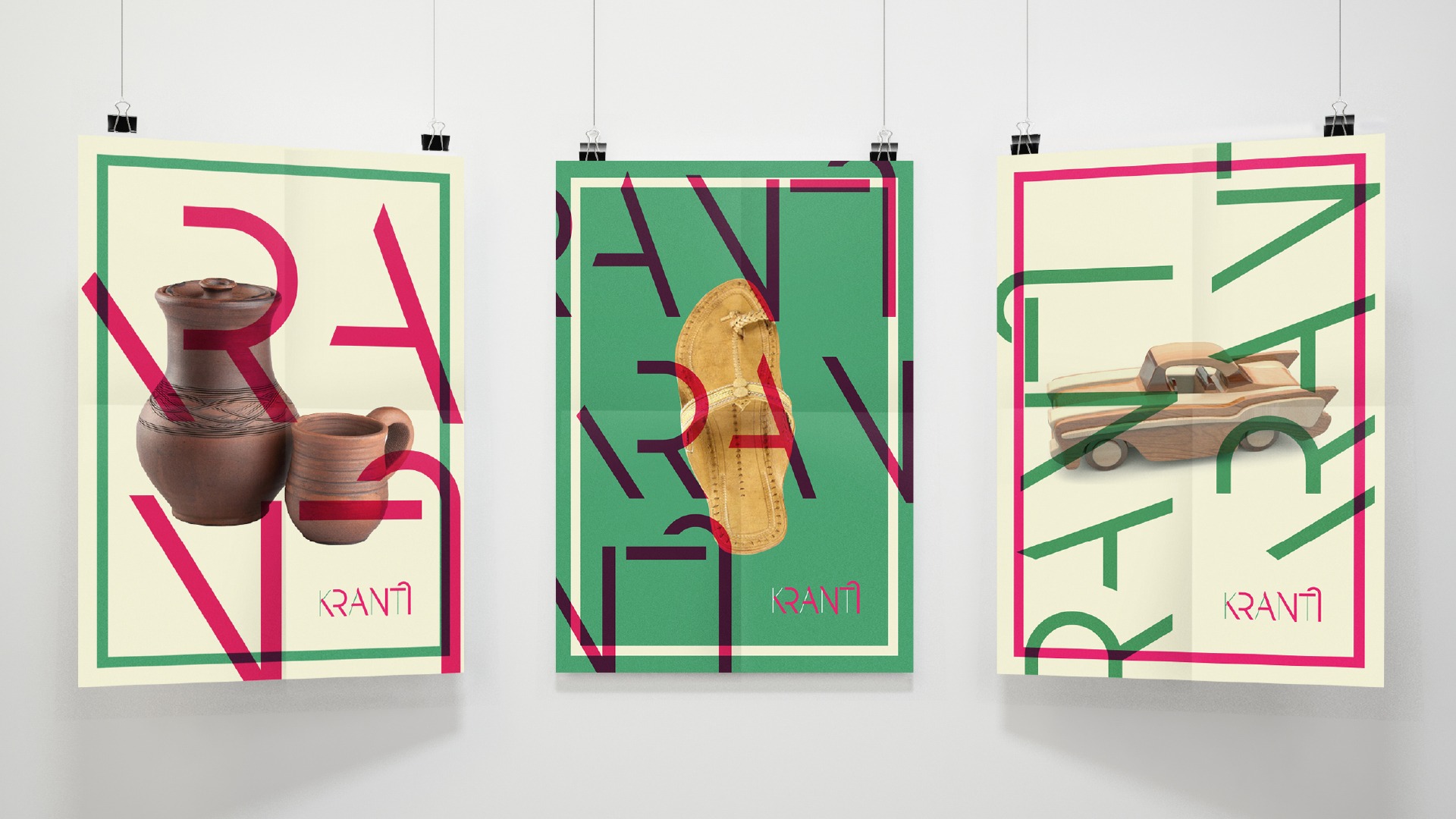
The logotype is clean and narrow, giving the brand a polished look and feel. At the same time, it borrows elements from the Devanagri script, which makes it relatable to a larger audience. To add to it, parts of the logotype are broken and layered to bring a sense of change and dynamism to the brand. These broken type forms are further used in the brand language as graphic elements, bringing life to the brand.
The colours used are inspired from traditional Maharashtrian sarees. Thus, they give us a sense of connect to the traditional roots of the artisans crafting these products.

Photographs of traditional products are placed in stylized and modern posters to reiterate the brand intention

The branding is taken forward into the marketing and collateral design


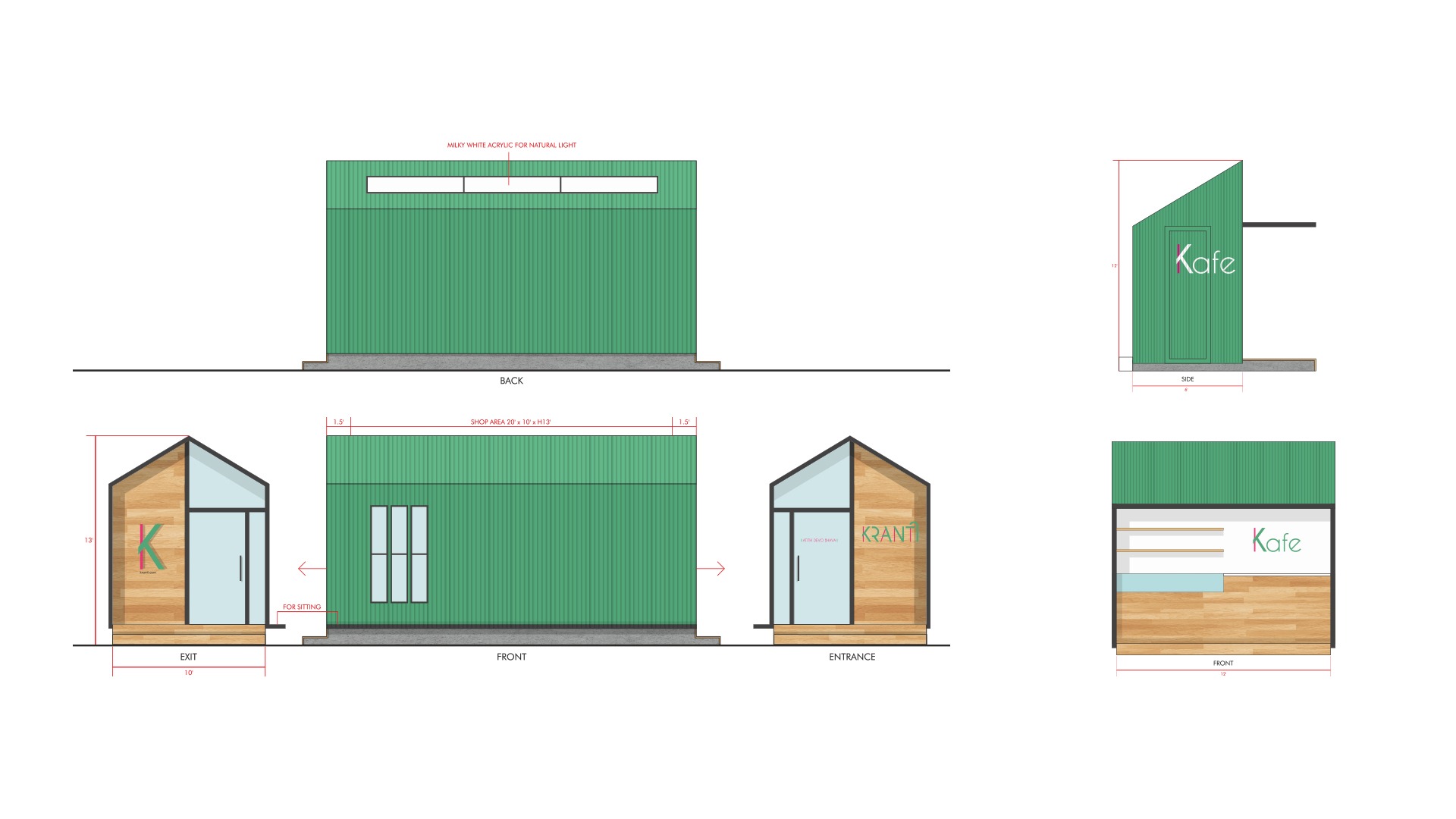
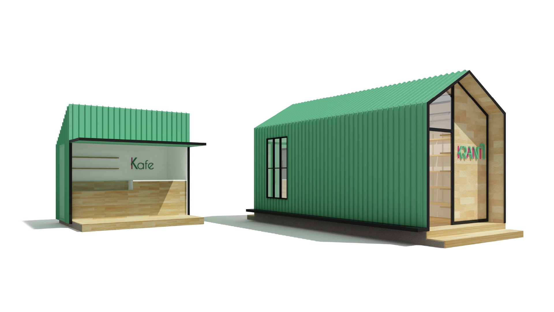
The traditional form of a hut is embodied in the retail design of the brand. The materials used are industrial-grade metal in contrast with wooden paneling
